Rumble Arena UX/UI design

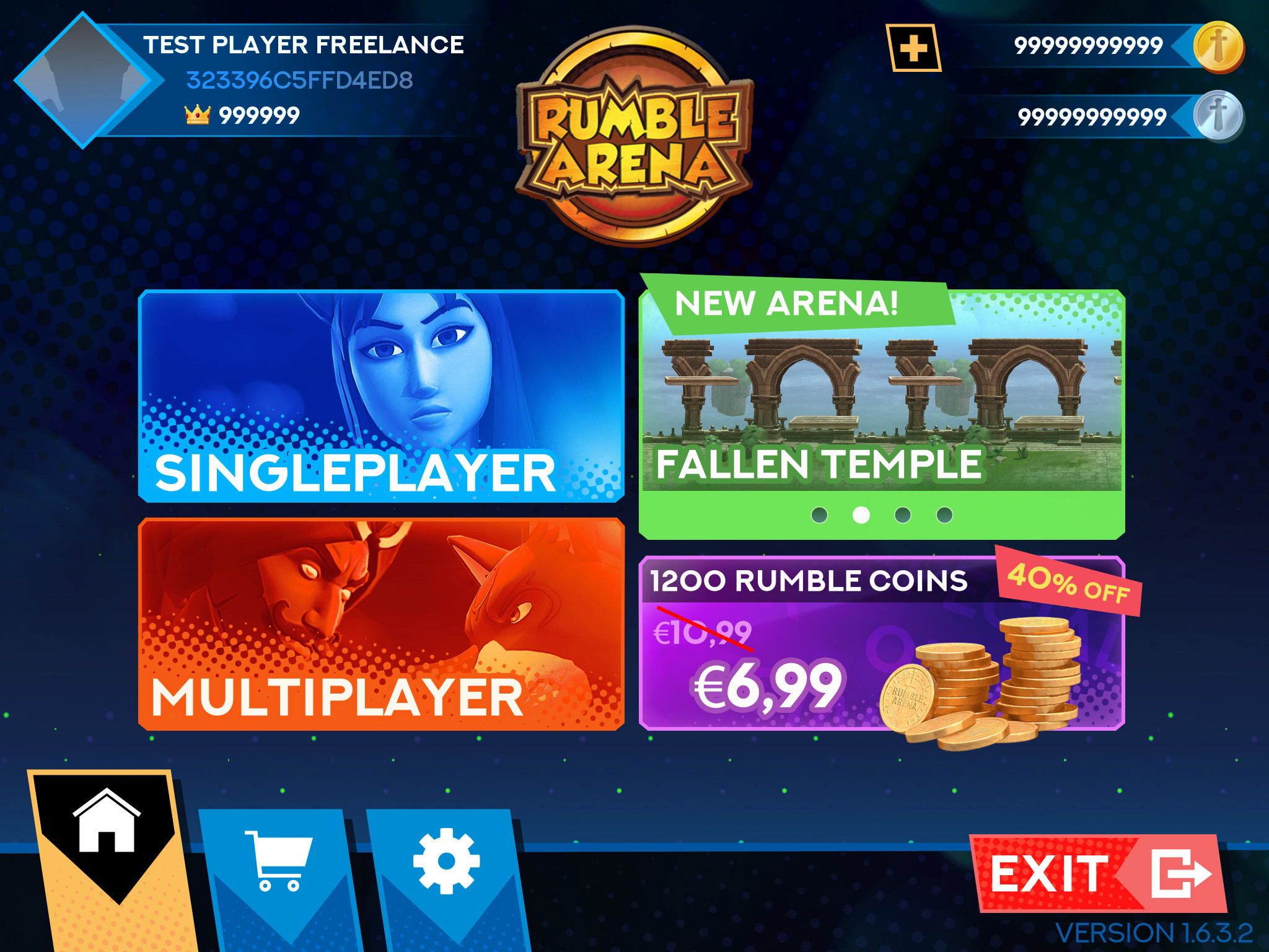
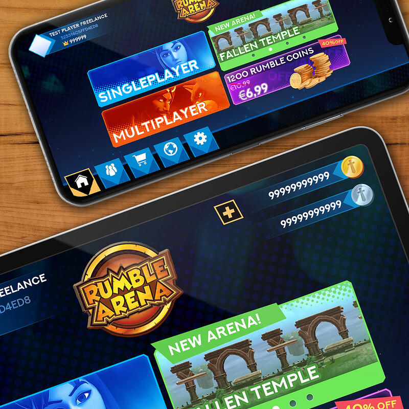
Main menu

Main menu

A quick unity setup to test the assets using the Doozy UI tool

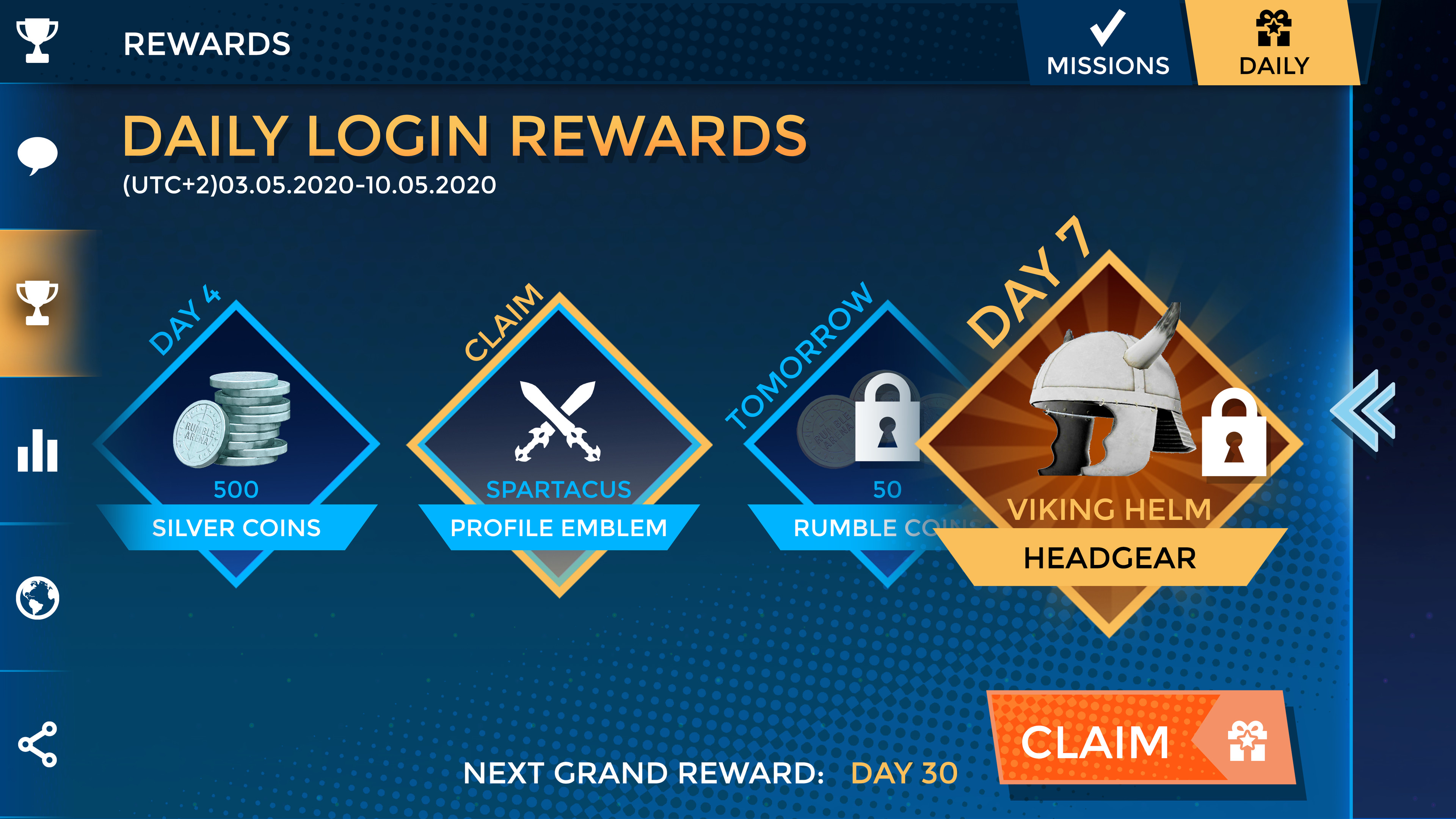
Daily login rewards screen

Daily login rewards screen

Quick test to convey the idea to the client

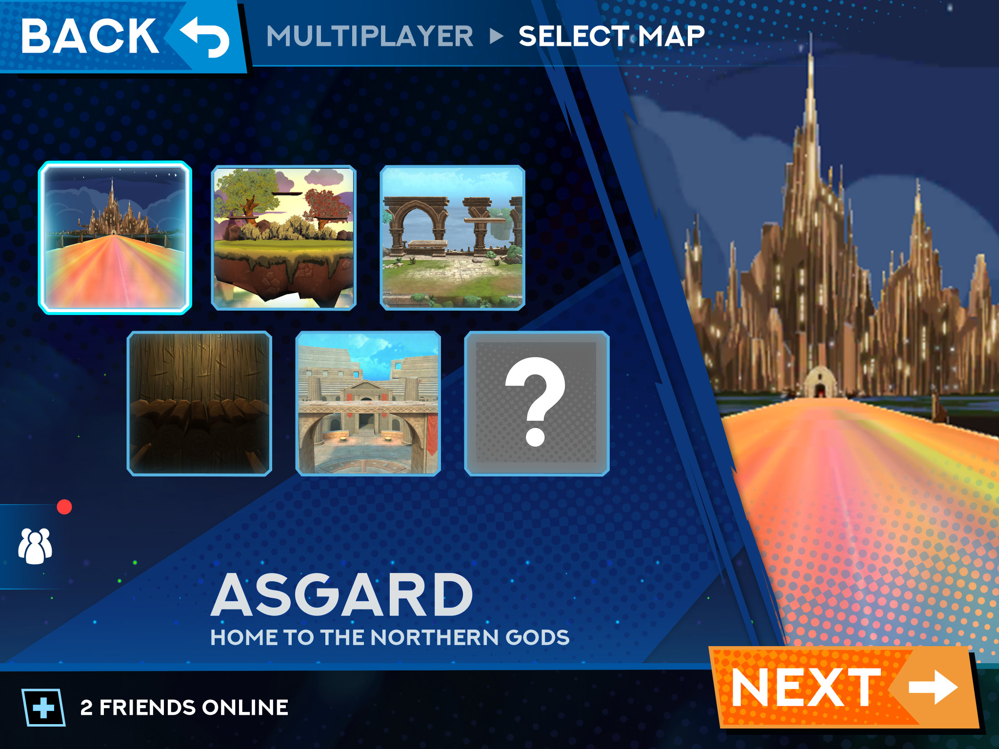
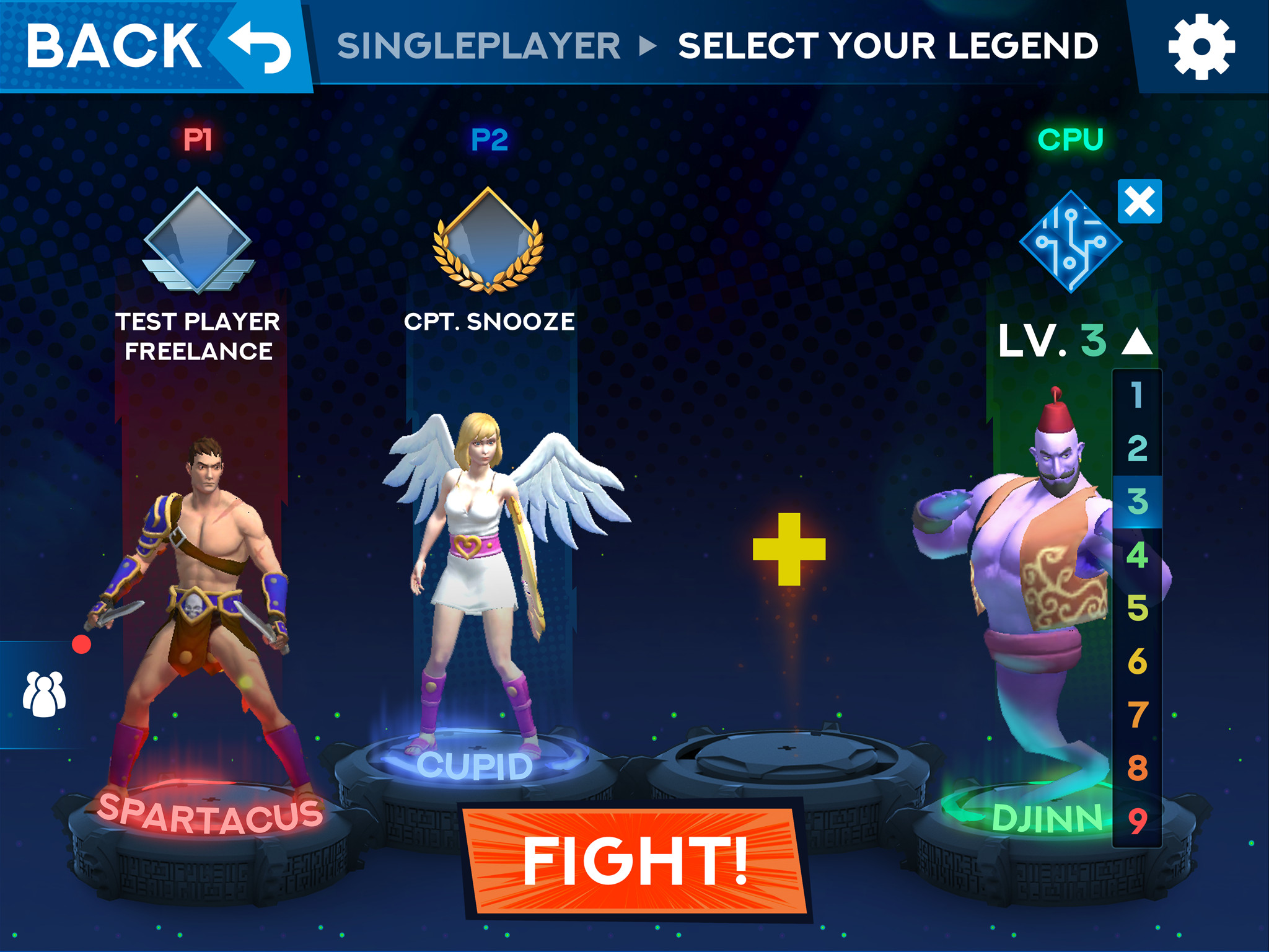
Level select screen

Level select screen

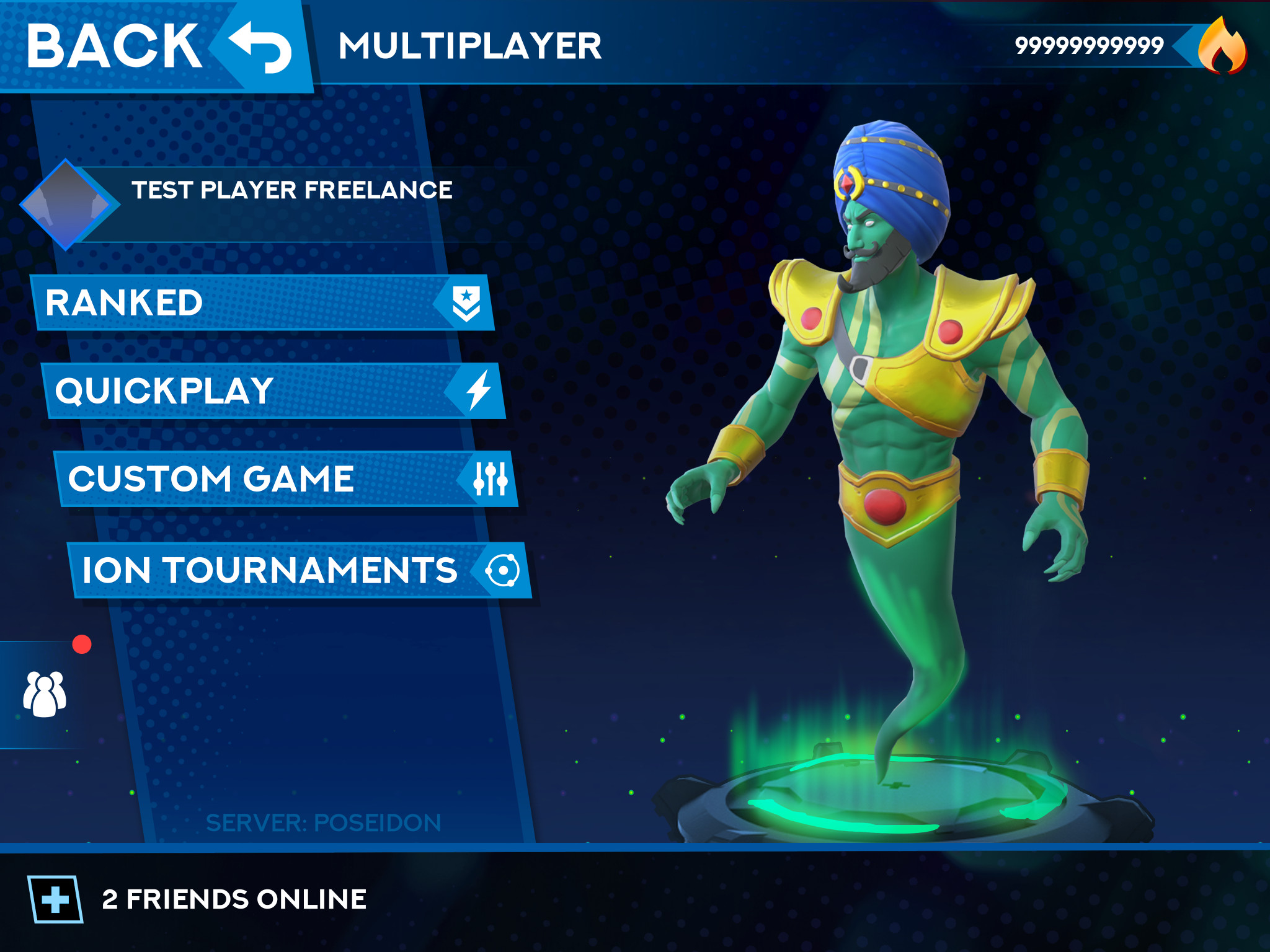
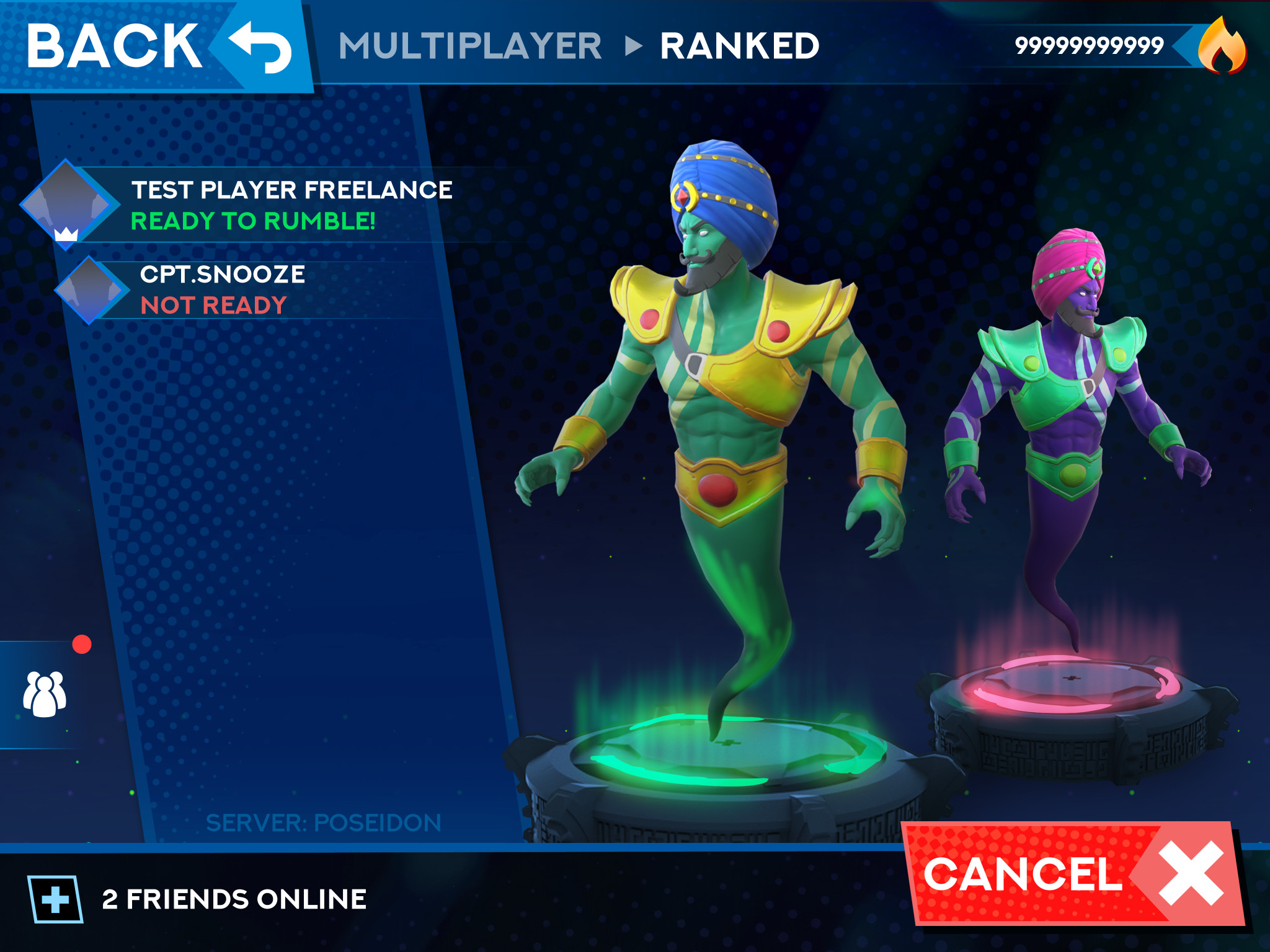
Multiplayer menu

Multiplayer menu

pre-battle UI

pre-battle UI

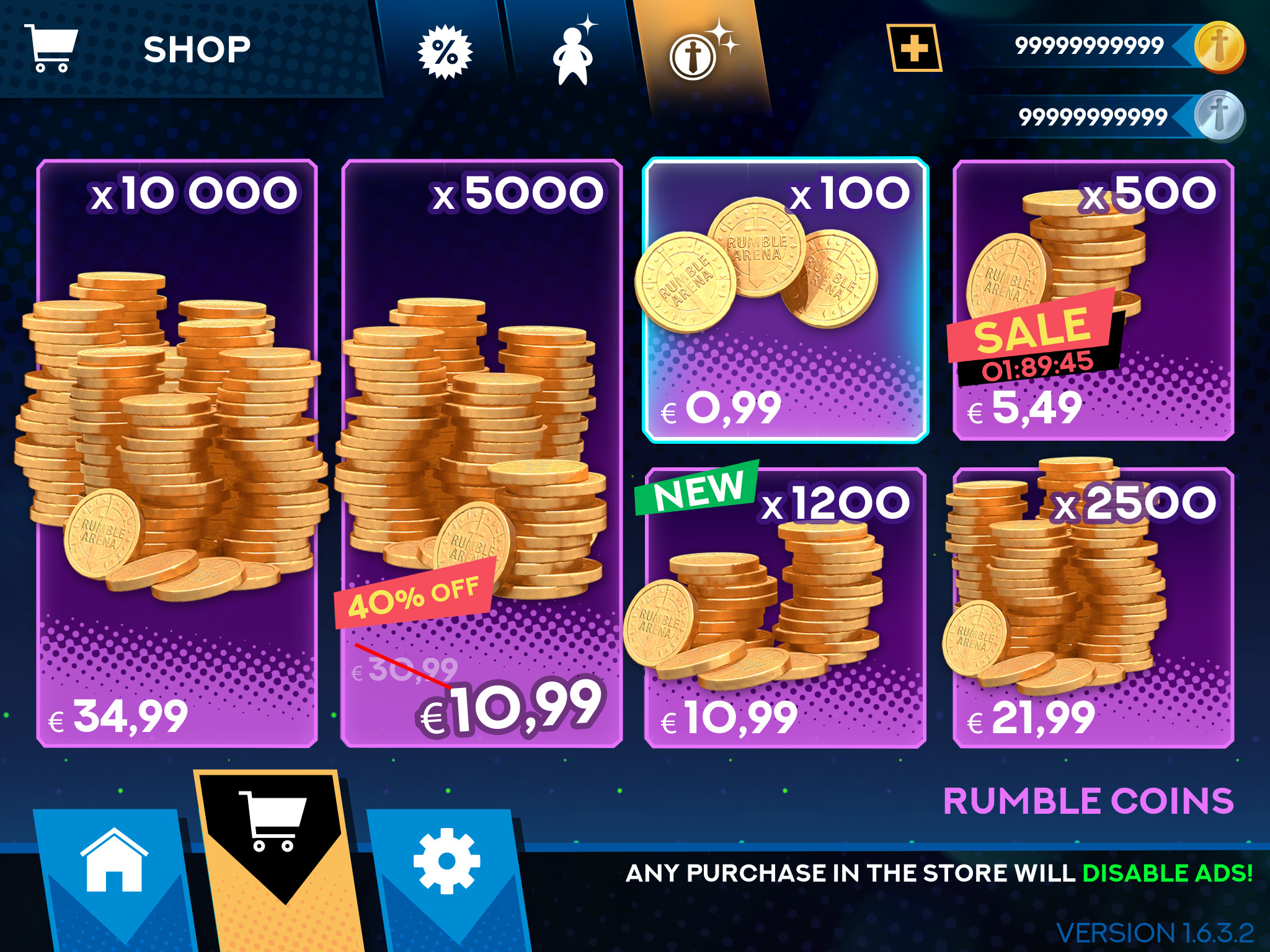
IAP shop

IAP shop

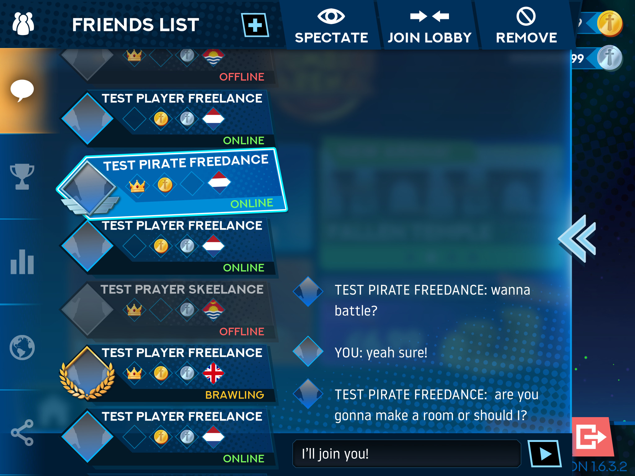
Social menu (info is placeholder)

Social menu (info is placeholder)

pop-up

pop-up

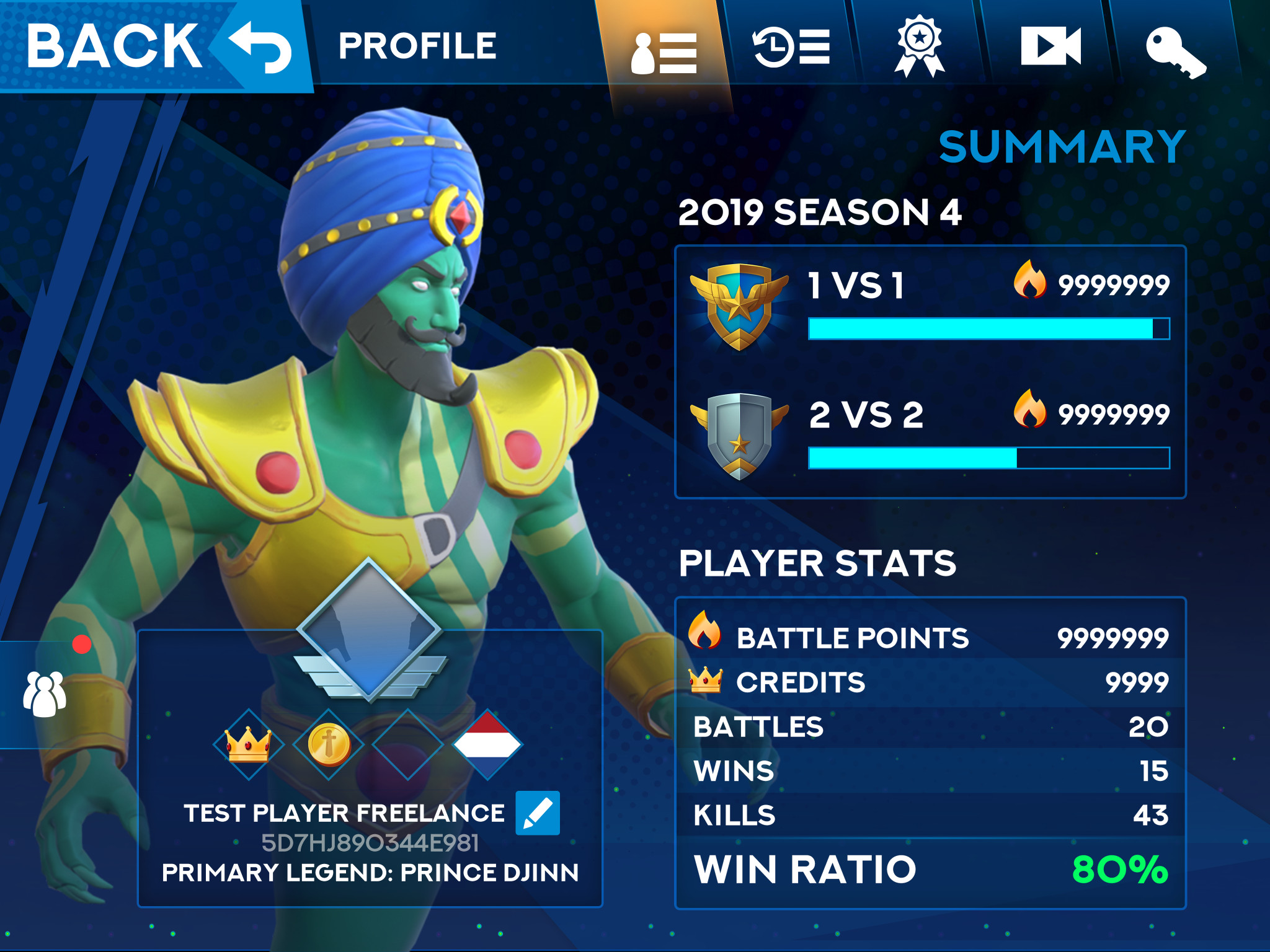
Player stats (info is placeholder)

Player stats (info is placeholder)

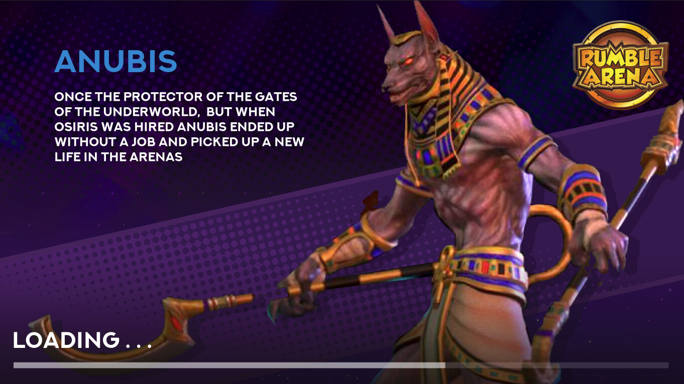
Loading screen (info is placeholder)

Loading screen (info is placeholder)

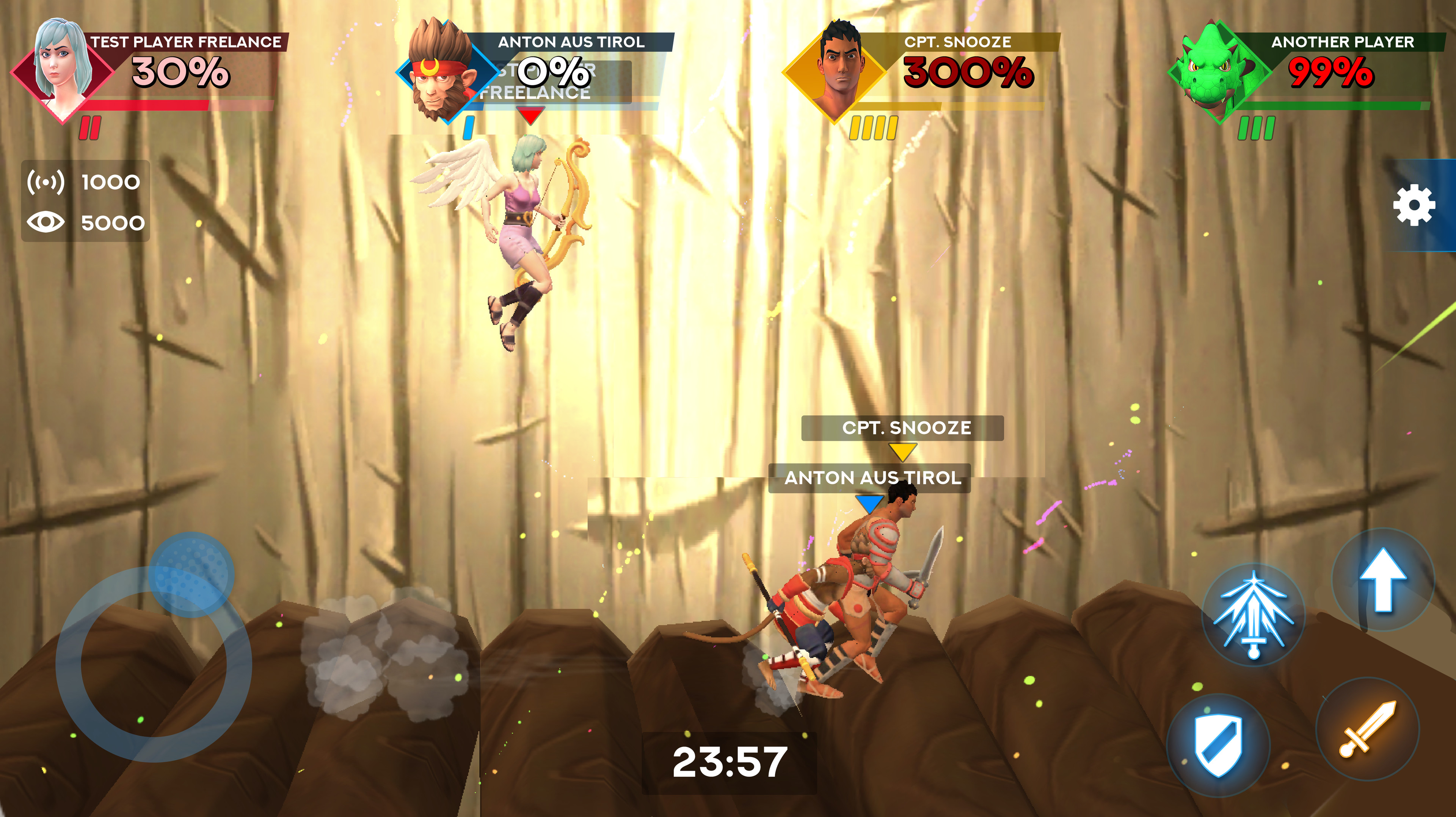
Battle UI, the elements in the corners can be scaled up or down in the game

Battle UI, the elements in the corners can be scaled up or down in the game

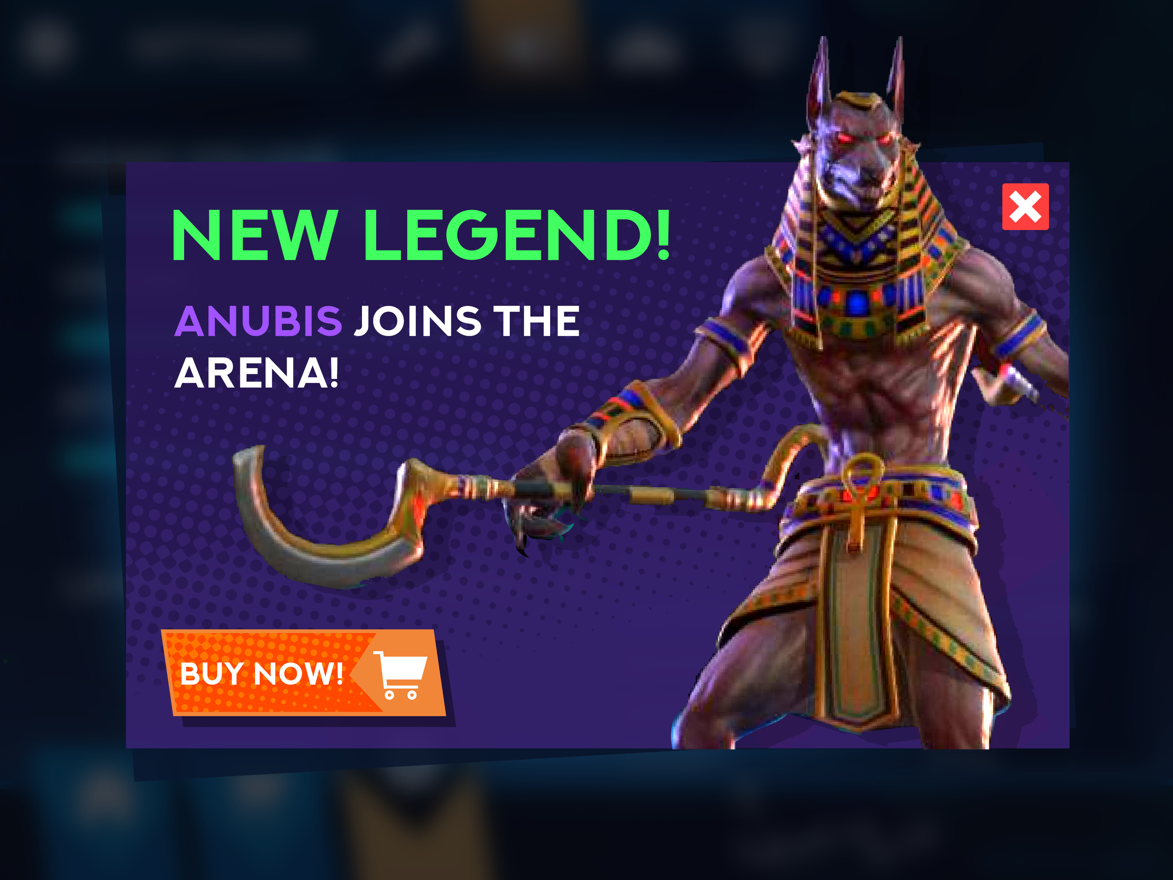
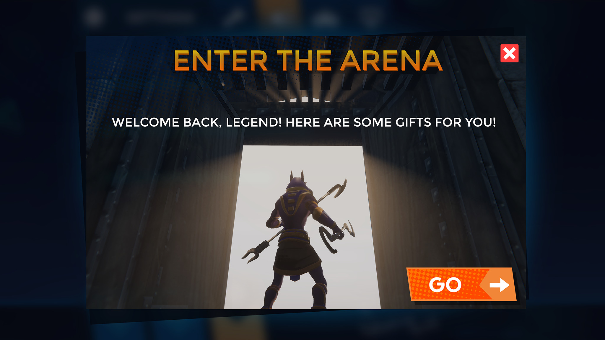
Returning player pop-up. Made a quick custom image using the character model in unity.

Returning player pop-up. Made a quick custom image using the character model in unity.

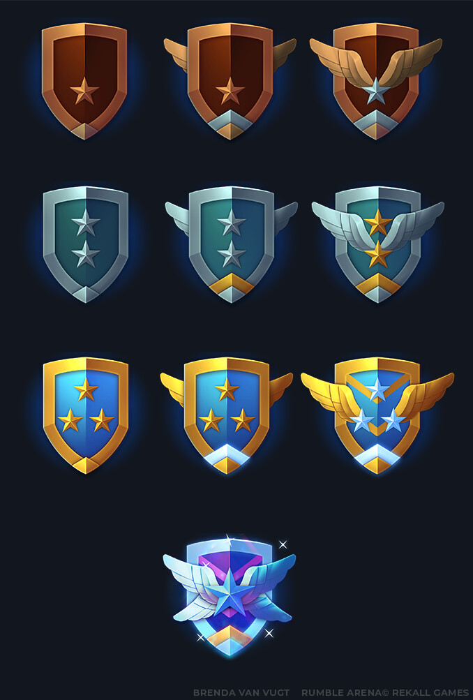
Set of rank-badges. I also provided a psd template for customization.

Set of rank-badges. I also provided a psd template for customization.

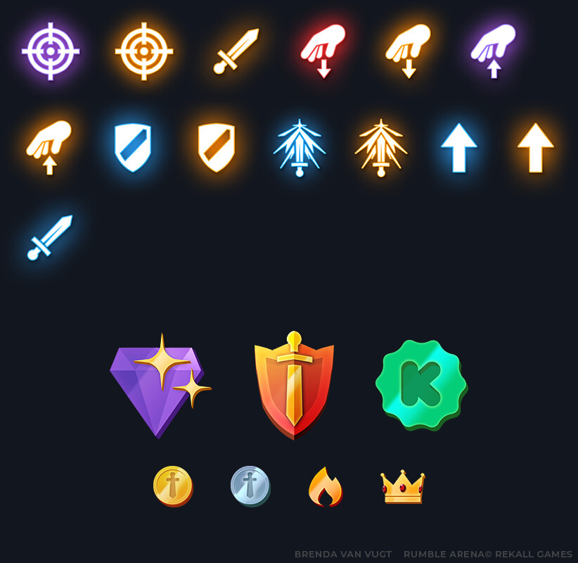
Battle icons, badges and currency icons

Battle icons, badges and currency icons

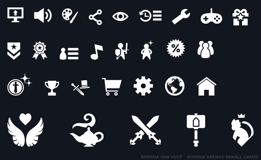
Flat menu icons and profile icons

Flat menu icons and profile icons

In 2019 and 2020 I had the pleasure to be working with Rekall games on their cross-platform brawler ' rumble arena'.
I mostly did UI design and icons, but helped with improving the UX design along the way.
Some images like level previews or character images were placeholder.
I designed most screens in 4:3 or 3:2 because I figured it'd be easier to scale from there towards widescreen instead of the other way around.

The UI style is inspired by games like smash bros and persona, but with a personal touch and one that is gentle/scalable for all platforms and not too hard to implement. I hope you like it!

I did not design the Rumble Arena Logo.